Aboutcontact
ABOUT
Contact
radio times / magazine

A Radio Times cover isn't rocket science, nor should it attempt to be. The first principle is to simply create the best image possible of that week's cover star(s). At their best they capture something of their subjects and the shows they represent, such as Ian Hislop's acerbic combativeness against Paul Merton's comedic tomfoolery or Cillian Murphy's menacing glare as Tommy Shelby. Being a fast-paced weekly, cover lines are written pretty late in the day (if you get them before a press day morning you count yourself lucky), hence the type is kept simple but bold.

More info

Two covers for successive series of detective drama Strike, adapted from JK Rowling's novels. The first was shot on set and combines two images with different focal lengths. The second, shot in a chilly field on location between filming, incorporates the duo's distinctive Land Rover. Photography: Richard Grassie

photoshoot / art direction / typography / layout

More info

The best visual gags can always be reinterpreted again and again. Ian Hislop and Paul were the perfect foils for a comic dual to showcase a new series of Have I Got News For You. Photography: Sven Arnstein

visual concept / photoshoot / styling direction / prop design / art direction / layout

More info

For the fiftieth anniversary of The Beatles Sgt. Peppers, Paul Merton presented a radio show in homage to the seminal album. We couldn't think of a more fun or striking way to celebrate the show than recreating part of the famous Peter Blake cover with Paul stepping into the shoes (and coats) of all of the fab four. Photography: Andy Earl, Hand-drawn Typography: Tobias Hall

visual concept / shoot planning / set design / photoshoot / art direction / illustration commission / layout

More info

Six change covers to showcase a special feature in collaboration with BAFTA for the Television Awards 2022 (the feature appears in Editorial). All talent were photographed over a couple of days in the studio. The intention was to capture them in the style of the classic Hollywood era, but with slightly less contrast and deep shadow than the feature images – sometimes commercial considerations trump artistic desires. Photography: Rachell Smith; Prop Styling: Propped Up

concept / photoshoot / art direction / typography / layout

More info

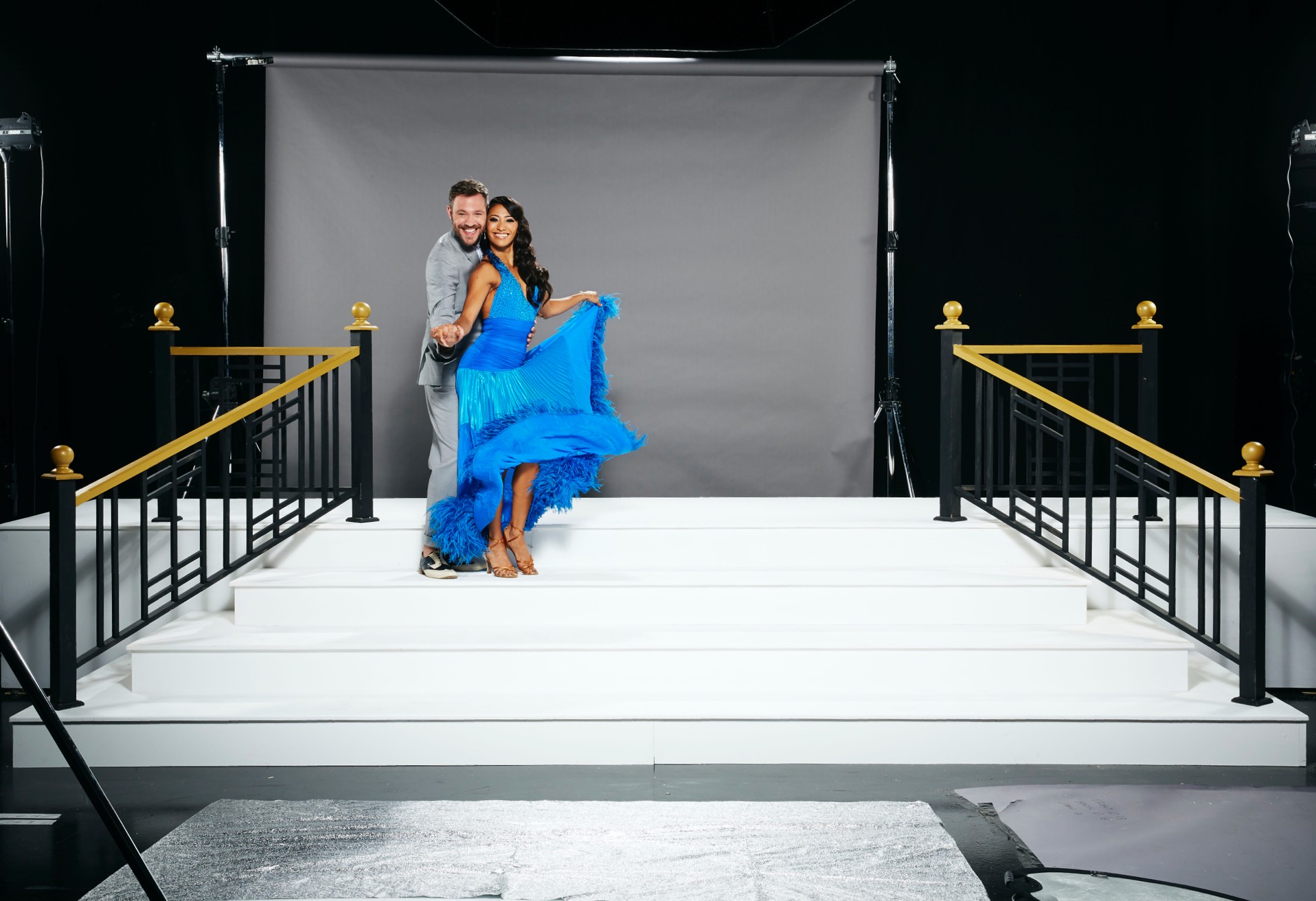
One of the biggest photoshoots in television for the opening of the most-watched show, Strictly Come Dancing. Two long days, thirty contestants and dancers, a small army of hair and make-up artists, a construction crew, two tins of white paint, a never-ending supply of coffee, and a plan to bring everyone together on two glamorous gate-fold covers. Photography: Nicky Johnston

visual concept / shoot planning / set design / photoshoot / art direction / typography / layout

More info

The plan for this cover was relatively fluid, as even as we were shooting we didn't know for certain how many people were going to be able to show up. Which makes for a certain amount of jeopardy and keeps you on your toes. Most of the image was constructed in post once I knew for certain what (and who) we had to work with. Photography: Mark Harrison

visual concept / shoot planning  / photoshoot / art direction / layout

More info

A slightly modern bard for a  Shakespeare season. The original idea was meant to posit the provocation that, were he alive today, he might be plying his trade writing television dramas or soap operas (hence the nod to Eastenders in the glasses), but the editor fell in love with his cover line so much that the copy didn't end up reflecting that. Best laid plans. Illustration: Bill Sanderson

visual concept / art direction / illustration commission / layout

More info

The trickiest aspect of setting up this cover shot of the Today show's presenting team wasn't getting the head positions just right (I may have cheated that a little in post) but getting them to pause discussing the news of day long enough to arrange the composition and look at the camera. As you may expect, they're very rarely all in the same place at the same time and were a bundle of energy and buzzy discussion. Great for the interview, slightly harder to harness for the photograph.

photoshoot / art direction / typography / layout

monty python / book

With a huge archive of prints, negatives and scans to choose from, picking one image for the cover of a fiftieth anniversary celebration that would encapsulate the show was nothing short of daunting. From the outset, though, the guiding principle was to be as true to the spirit of the show as possible. To that end, the maybe more expected shot of all the Pythons neatly arranged seemed out of keeping. The 'It's Man' would hilariously open each episode with his mad scramble towards the screen, being cruelly cut off every time just as he reached the viewer and took a breath. As such, it seemed only fitting that the iconic character do the same for the book.

More info

Whittling down the hundreds of photos of Monty Python's Flying Circus in the Radio Times archive to a single shot that encapsulated the show was a mammoth task. As Michael Palin's 'It's' Man would scramble towards the camera to open each episode, it felt equally appropriate that he also front this celebratory book.

picture research / art direction / layout

virgin trains / magazine

Like most companies, Virgin Trains were keen to showcase their staff on the covers of their employee publication. But, after the first couple of issues of nice genial portraits, the feedback came back from them that, although they were perfectly nice and all that, they didn't feel like they represented the irreverent fun and liberties we took with the brand (which was very much on-brand) in the rest of the magazine. So, I pitched them the idea that, with a little extra budget, we could commission a different illustrator each issue to add a playful layer that spoke to the person and the subject, and do it with an exuberance that would put a smile of people's faces. They jumped at it. It wasn't long before an appearance on the cover became somewhat sought-after, and we were printing framed copies for cover stars to take home and hang on the toilet wall.

More info

The funky background is actually an opportunistically appropriated window to a Paperchase store at the station in which the shot had to be taken. Good customer service is a difficult concept to get across visually. The army of miniature butlers was a quirky way of getting the idea across. Photography: Phil Adams

visual concept / photoshoot / art direction / illustration commission / reprographics / layout

More info

A round-up of covers that features stories about a member of staff praised by Sir Richard Branson, another whose job involved organising the company-sponsored V-Festival, and the unveiling of the new uniform designed especially for the London 2012 Olympic Games. Photography: Phil Adams

visual concept / photoshoot / art direction / illustration commission / reprographics / layout

More info

Staff at Carlisle were giving ghost tours underneath the station, and were good sports when asked to embrace a bit of theatricality in order to make this spooky cover all the more fun and effective. Photography: Richard Lea-Hair, Illustration: Sarah Coleman/Inky Mole

visual concept / photoshoot / art direction / illustration commission / reprographics / layout

discover tv / magazine

Discover TV was launched as a response to the rise and importance of streaming services and the abundance of content that they now produce. Radio Times readers are very much traditional viewers of linear television and would have seen the encroachment of digital-only shows into the features run as a reduction in the content that they were used to. The magazine couldn't ignore such a large, predominantly younger, viewership, though. So by launching a separate supplement devoted to the streamers it could open up content to new readers while reassuring long-term readers that it provided added-value to the existing product.

More info

It was felt that the supplement would benefit from a slightly different design to the main magazine, so I worked with the editor to create a look that felt a little younger and made bolder use of colour, without straying too far from what traditional long-standing readers were used to.

creative strategy / editorial design / magazine launch

other / magazines

A selection of covers from other publications. A selection of covers from othehbbbbbxxxxxxxxxxxxxxxxxxxxr publications. A selection of covers from other publicatio.

More info

A Radio Times Travel supplement featuring Monet's garden.

art direction / layout

homeeditorialDigitalimagesprojectsCoversbrandingpitches